
Want to make your paintings pop and feel real? Adding depth is key. What is depth in painting? It’s the illusion of three dimensions on a flat surface. Can I add depth to any painting? Yes, with the right techniques, you can transform a flat image into something that draws the viewer in. Who is depth important for? Every artist aiming for realism or a sense of space. This guide will show you five powerful ways to achieve that captivating depth in your artwork.
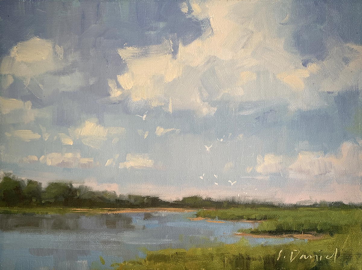
Image Source: realismtoday.com
1. Mastering the Value Scale for Spatial Illusion
The first fundamental step to creating depth is a solid grasp of the value scale. This refers to the range of light to dark tones in an artwork. Artists use this scale to mimic how light behaves in the real world, which is crucial for creating a believable sense of space.
The Impact of Light and Shadow
In reality, objects closer to us appear brighter and have sharper contrasts between light and shadow. As objects recede into the distance, they become dimmer and the shadows soften. This is because light has to travel further through the atmosphere to reach them, scattering and losing intensity along the way.
Creating Foreground, Midground, and Background
- Foreground: Objects in the foreground are typically rendered with the highest contrast and the lightest values. This is where you’ll find your brightest highlights and deepest shadows. They should feel immediate and well-lit.
- Midground: Elements in the midground will have a slightly lower contrast than the foreground. Their values will be more muted, and shadows will begin to soften.
- Background: Objects in the background should have the lowest contrast and the lightest values overall. Shadows will be very soft, and highlights will be subtle.
Practical Application of Value
To practically apply this, think about a landscape. A tree in the foreground might have bright, crisp highlights on its leaves and dark, defined shadows. A tree in the far distance might appear as a soft, indistinct shape with very little contrast between light and shadow.
Table: Value and Distance Relationship
| Distance | Contrast | Light Values | Dark Values | Shadow Softness |
|---|---|---|---|---|
| Foreground | High | Brightest | Darkest | Sharp |
| Midground | Medium | Lighter | Darker | Softening |
| Background | Low | Lightest | Lightest | Very Soft |
By consciously adjusting the values of your elements based on their perceived distance, you create a strong visual cue for the viewer, guiding their eye into the painting and establishing a clear sense of depth. This is the bedrock upon which many other depth-creating techniques are built.
2. Harnessing Color Theory for Atmospheric Perspective
Color theory plays a vital role in creating the illusion of depth, especially through a technique called atmospheric perspective. This is how colors and their intensity change as they appear further away from the viewer due to the scattering of light by particles in the atmosphere (like dust, fog, or moisture).
The Science Behind Color and Distance
- Cool Colors Recede: Cool colors, such as blues and purples, tend to recede visually. They appear further away than warm colors.
- Warm Colors Advance: Warm colors, like reds and oranges, tend to advance visually, appearing closer to the viewer.
- Color Saturation: As objects move further into the distance, their colors become less saturated – less vibrant and intense. They tend towards the color of the atmosphere, which is often a bluish-gray.
- Contrast Reduction: Similar to value, the contrast between colors also decreases with distance. Subtle shifts in hue and tone become more apparent than strong color differences.
Applying Atmospheric Perspective
Imagine a landscape with a bright red barn in the foreground, a green field in the midground, and distant blue mountains.
- Foreground Barn: The red barn would be painted with a vibrant, saturated red, with strong contrasts between light and shadow.
- Midground Field: The green field would be a less saturated green, with softer edges and less contrast.
- Distant Mountains: The blue mountains would be rendered in a desaturated, cool blue-gray, with very soft edges and minimal contrast.
This consistent application of color shifts makes the scene feel natural and expansive, pulling the viewer’s eye into the depicted space.
Optical Mixing and Subtle Shifts
Optical mixing can also be used here. Instead of mixing colors directly on the palette to create a desaturated hue for the background, an artist can place small dots or strokes of different colors next to each other on the canvas. When viewed from a distance, these colors will “mix” in the viewer’s eye, creating a softer, more atmospheric effect. For example, a distant object might be represented by small strokes of blue and green placed close together, which appear as a muted teal from afar.
Table: Color and Distance Application
| Distance | Dominant Color Temperature | Saturation | Contrast |
|---|---|---|---|
| Foreground | Warm/Neutral | High | High |
| Midground | Neutral/Cool | Medium | Medium |
| Background | Cool | Low | Low |
By understanding and applying these principles of color theory, you can create a powerful sense of atmospheric depth that makes your paintings feel more realistic and engaging.
3. The Power of Chiaroscuro and Subtractive Lighting
Chiaroscuro is an Italian artistic term meaning “light-dark.” It refers to the dramatic use of strong contrasts between light and dark, usually bold contrasts affecting a whole composition. This technique is incredibly effective at creating a sense of volume, drama, and most importantly, depth. When combined with the concept of subtractive lighting, it can sculpt forms and push them back into space.
Sculpting with Light and Shadow
Chiaroscuro doesn’t just mean having light and dark areas; it means using them strategically to define form and create a focal point.
- Dramatic Lighting: Imagine a single light source illuminating a subject from one side. The side facing the light will be brightly lit, while the opposite side will fall into deep shadow. This strong contrast emphasizes the three-dimensionality of the object, making it appear to “pop” out of the background.
- Depth Through Shadow: The shadows themselves create depth. A shadow cast by one object onto another, or a deep shadow falling within the folds of fabric, suggests planes receding into space. These shadows are not just dark areas; they are integral to defining the form and its relationship to the surrounding environment.
Subtractive Lighting Explained
Subtractive lighting is about how light is removed or absorbed by surfaces, rather than just how light falls. It’s about the subtle gradations of shadow and how they define form.
- Gradual Shadow Transitions: Instead of a hard edge between light and shadow, there’s often a gradual transition. This subtle shift in value – the value scale again – helps the viewer perceive the curved surface of an object.
- The Illusion of Form: When you paint a sphere, you don’t just paint a circle and then add a dark crescent. You use a range of values from the brightest highlight, through mid-tones, to the darkest shadow, and then a reflected light from the surface it’s resting on. This smooth transition is key to making the sphere look round and three-dimensional.
Creating Volume and Drama
Chiaroscuro is particularly effective when used to create a focal point. By illuminating a specific area with bright light and surrounding it with deep shadows, the artist draws the viewer’s eye directly to that subject. This contrast immediately creates a sense of drama and depth, as the illuminated subject appears to emerge from a darker, less defined space.
Table: Chiaroscuro Elements for Depth
| Element | Purpose | Effect on Depth |
|---|---|---|
| Highlights | Brightest points of light | Make forms appear to advance and protrude |
| Mid-tones | Gradual transitions between light and shadow | Define the curvature and volume of forms |
| Shadows | Areas where light is blocked | Push forms back into space, create recession |
| Cast Shadows | Shadows projected by objects onto surfaces | Define spatial relationships and depth |
| Core Shadow | The darkest part of the shadow on an object | Emphasizes form and turning away from light |
By masterfully employing chiaroscuro and paying attention to the nuances of subtractive lighting, artists can imbue their paintings with a powerful sense of volume and dramatic depth, making subjects feel tangible and real.
4. Employing Glazing Techniques and Layering Paint
Glazing techniques and layering paint are sophisticated methods that add depth and luminosity to a painting by building up color and value in thin, transparent or semi-transparent layers. This process creates a richness and complexity that is difficult to achieve with opaque paint alone.
The Art of the Transparent Layer
A glaze is a thin coat of paint applied over an existing layer. It’s mixed with a medium (like linseed oil or a specific glazing medium) to make it transparent.
- Building Luminosity: Each transparent layer allows the colors beneath to show through. This creates a cumulative effect, where the light passes through the upper layers, reflects off the lower layers, and then passes back through, giving the colors a deep, glowing quality. This is particularly effective for skin tones, glass, or gemstones.
- Subtle Color Shifts: Glazes allow for very subtle shifts in hue and tone. You can layer a thin wash of yellow over blue to create a luminous green, or a thin glaze of red over orange to create a richer, deeper hue.
- Creating Depth: By layering cooler, more desaturated glazes over warmer, more saturated underlayers in the background, you can effectively push those elements further back. Conversely, warmer, more saturated glazes can be applied to foreground elements to bring them forward.
Layering Paint for Complexity
Beyond traditional glazing, simply layering paint in general – whether opaque or transparent – contributes to depth.
- Opaque Layers for Foreground: Opaque layers are excellent for building up the details and textures of foreground objects. These layers can have thick impasto strokes, adding physical texture and a sense of immediacy.
- Scumbling: This technique involves applying a thin, broken layer of opaque or semi-opaque paint over a dry underlayer, allowing some of the underlayer to show through. It’s great for creating texture and softening edges, which can add to the illusion of distance when applied to background elements.
- Dry Brushing: Applying paint with a dry brush leaves a broken, textured effect, allowing the underlayer to show through. This can create a sense of atmospheric haze or the rough texture of distant objects.
Table: Glazing vs. Opaque Layering for Depth
| Technique | Primary Use | Effect on Depth |
|---|---|---|
| Glazing | Building luminosity, subtle color shifts | Pushes elements back, creates glowing depth |
| Opaque Layers | Defining form, texture, foreground detail | Brings elements forward, adds tactile presence |
| Scumbling | Softening edges, creating texture | Creates atmospheric haze, softens distant forms |
| Dry Brushing | Texture, atmospheric effects | Mimics weathered surfaces, adds atmospheric distance |
The slow, deliberate process of glazing techniques and layering paint allows artists to build up a rich, multi-dimensional surface. This meticulous approach not only adds visual depth but also a tangible sense of history and complexity to the artwork, making it more engaging for the viewer.
5. Implementing Foreshortening and Perspective Grids
Foreshortening is a powerful technique that makes objects appear shorter than they actually are because they are angled toward the viewer. It’s a crucial element in creating convincing depth and realism, especially when depicting figures or objects at dynamic angles. When combined with accurate perspective, it can transform a flat canvas into a three-dimensional space.
What is Foreshortening?
Imagine painting an arm reaching directly out towards the viewer. The arm would appear much shorter and wider than if it were painted from the side. This distortion is foreshortening.
- Defining Volume and Space: Correctly executed foreshortening makes forms appear to extend out of the picture plane or recede into it. It’s about accurately depicting how an object appears when viewed from a specific angle.
- Drawing Challenges: Foreshortening is notoriously difficult because it requires artists to abandon their usual proportions and instead rely on careful observation of how forms appear compressed and distorted.
Using Perspective Grids
To achieve accurate foreshortening and overall depth, artists often use perspective grids.
- One-Point Perspective: Used when the viewer is looking directly at a flat surface of an object (like the front of a house). Parallel lines converge at a single vanishing point on the horizon line.
- Two-Point Perspective: Used when the viewer is looking at an object from an angle, so both the front and side planes are visible (like a cube viewed from a corner). Parallel lines converge at two vanishing points on the horizon line.
Creating Depth with Grids
A perspective grid is a visual guide that helps you draw objects realistically within a defined space.
- Placement of Elements: The grid helps you place elements correctly in relation to each other and the implied space of the painting. Objects that appear smaller and closer to the vanishing points will seem further away.
- Accurate Foreshortening: By drawing lines that follow the perspective grid, you can accurately depict foreshortening. For example, to draw a table leg that recedes into the distance, you would draw it so its lines converge towards the appropriate vanishing point.
Table: Key Elements for Foreshortening and Perspective
| Element | Definition | Contribution to Depth |
|---|---|---|
| Foreshortening | Depicting an object or body part shorter than it actually is because it is angled toward the viewer. | Creates a strong sense of projection and recession. |
| Perspective Grid | A system of lines that converge to vanishing points, used to create the illusion of depth on a flat surface. | Provides structure for accurate placement and depiction of spatial relationships. |
| Vanishing Point | A point on the horizon line where parallel lines appear to converge. | Dictates the direction and recession of forms. |
| Horizon Line | An imaginary horizontal line at eye level. | Establishes the viewer’s viewpoint and the plane of the background. |
By diligently studying and applying foreshortening and utilizing perspective grids, artists can create powerful illusions of depth, making their subjects feel grounded in a believable three-dimensional space. This is especially vital for figurative work and architectural subjects.
Frequently Asked Questions (FAQ)
Q1: What is the difference between atmospheric perspective and linear perspective?
A1: Atmospheric perspective deals with how colors and details change with distance due to the atmosphere (colors get cooler, less saturated, and details blur). Linear perspective uses geometric principles with vanishing points and horizon lines to create the illusion of receding space and accurate proportions. Both contribute to depth.
Q2: Can I use all these techniques in one painting?
A2: Absolutely! The most effective paintings often combine multiple techniques to create a rich and convincing sense of depth. For example, you might use chiaroscuro to define a foreground figure, atmospheric perspective for the background landscape, and glazing techniques for subtle color shifts.
Q3: Is impasto good for creating depth?
A3: Impasto, the application of thick paint, primarily adds physical texture and can make elements appear to come forward due to the texture catching light. While it can enhance the perceived depth of specific foreground elements by making them more tangible, it’s not a primary technique for creating the illusion of receding space like atmospheric perspective or linear perspective.
Q4: How do I practice foreshortening?
A4: The best way to practice foreshortening is through direct observation. Draw and paint objects angled towards you. Use your value scale to capture the changing light and shadow on these foreshortened forms. Take photos of objects at extreme angles and use them as references.
Q5: What is the role of subtractive lighting in modern painting?
A5: Subtractive lighting continues to be fundamental. It’s about how light is absorbed and reflected, defining form through nuanced transitions between light and shadow. Even in styles that aren’t strictly realistic, understanding how light sculpts form is crucial for creating a sense of volume and presence.